
Interpreting Results#
This chapter covers how to interpret results from the experiment directory.
To interpret the results:
The ablator initially consolidates the metrics from all the trials into a unified combined dataframe.
Utilize the Pandas dataframe to generate insightful plots depicting the relationship between metrics and parameters outlined in the configuration.
Importing Libraries.#
from ablator.analysis.results import Results # for formatting results
from ablator import PlotAnalysis, Optim # for plotting

from ablator import ParallelConfig, ModelConfig, configclass # for configs

from pathlib import Path # for defining path
import pandas as pd # for reading dataframe
To create pandas dataframe#
Define/Import all the custom configs used during the HPO (if using separate files for HPO and Analysis).
@configclass
class CustomModelConfig(ModelConfig):
  num_filter1: int
  num_filter2: int
  activation: str

@configclass
class CustomParallelConfig(ParallelConfig):
  model_config: CustomModelConfig
Generating results#
The Results class is responsible for processing the results within all the trial directories.
The read_results() method from the Result class reads multiple results in parallel from the experiment directory using Ray. It returns all the combined metrics as a dataframe.
In this code snippet, a directory path is defined. Results are read from that directory. Subsequently, the results are saved to a CSV file.
directory_path = Path('./experiment_1901_aa90')

results = Results(config = CustomParallelConfig, experiment_dir=directory_path, use_ray=True)

df = results.read_results(config_type=CustomParallelConfig, experiment_dir=directory_path)

df.to_csv("results.csv", index=False)
Plotting graphs#
The PlotAnalysis class is utilized for plotting graphs.
The responsibilities of the PlotAnalysis class include:
Generating plots between the provided metrics and parameters.
Mapping the output and attribute names to user-provided names for better readability.
Storing the generated plots in the desired directory.
Transforming the dataset, so it gives the best validation accuracy for each trial.
df = (
        df.groupby("path")
        .apply(lambda x: x.sort_values("val_accuracy", na_position="first").iloc[-1])
        .reset_index(drop=True)
    )
Creating dictionaries that map the configuration parameters [categorical + numerical] to custom labels for plots.
The keys are the parameters inside the configuration file, and the values are the custom names.
Renaming attributes/metrics to custom names is optional. If not provided, the names will be the default like “train_config.batch_size”.
categorical_name_remap = {
        "model_config.activation": "Activation",
    }
numerical_name_remap = {
        "model_config.num_filter1": "N. Filter 1",
        "model_config.num_filter2": "N. Filter 2",
        "train_config.optimizer_config.arguments.lr": "Learning Rate",
    }

attribute_name_remap = {**categorical_name_remap, **numerical_name_remap}
Finally, pass the following to the PlotAnalysis:
dataframe: Pandas dataframe.
cache: Whether to cache results.
optim_metrics: A dictionary mapping metric names to optimization directions.
numerical_attributes: List of all the numerical attributes plotted concerning metrics.
categorical_attributes: List of all the categorical attributes plotted for metrics.
analysis = PlotAnalysis(
        df,
        save_dir="./plots",
        cache=True,
        optim_metrics={"val_accuracy": Optim.max},
        numerical_attributes=list(numerical_name_remap.keys()),
        categorical_attributes=list(categorical_name_remap.keys()),
    )
The main_figures() method is responsible for generating graphs, specifically a Linear plot for numerical attributes and a violin plot for categorical values.
To generate these plots, pass the mappings of metrics and attributes dictionary.
analysis.make_figures(
        metric_name_remap={
            "val_accuracy": "Validation Accuracy",
        },
        attribute_name_remap= attribute_name_remap
    )
Finally, the directory “plots” will contain all the plots of the HPO experiments
Analysis#
Now, we can see the plots generated for our previous HPO tutorial. These plots represent the experiment conducted in the HPO chapter. The results may vary depending on the specific values used for each trial within the search space.
Linearplots#
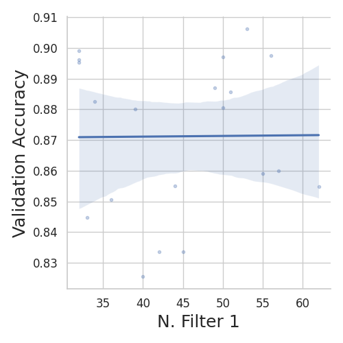
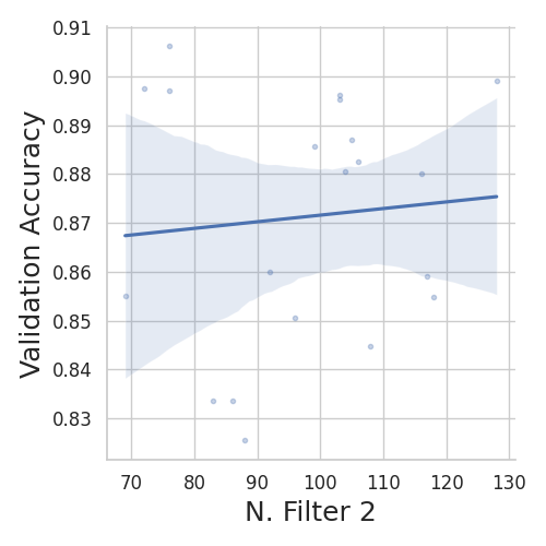

We can see that, with an increase in learning rate, the model’s validation accuracy decreases. The number of filters does not have a significant impact on the accuracy. However, N. Filter 2 shows some positive correlation with the performance.
Violinplots#

For activation functions, we can see “relu” and “leaky relu” perform better for this problem. Training with “elu” scores low accuracy on the validation set. Overall, “leaky-relu” gave the highest accuracy for the experiment.
Observations#
In an HPO process, hyperparameters are randomly selected for each trial from a predefined search space, using algorithms such as ‘random’ or ‘TPE’ to generate values. When TPE is used ablation experiments can be biased towards a specific hyper-parameter range. For example, for different random initialization of TPE, it randomly sampled a higher learning rate for which smaller network (fewer channels) performed better. The contrary results were obtained using TPE where a random initialization sampled from smaller learning rates, favoring a larger neural network (more channels).
As a result, it appears we get contradictory conclusions for our Ablation experiments. We NOTE, that it is important to select a Random strategy when performing ablation experiments where we want to be definite about the performance of a method. For example, using a Random optimization strategy have us conclude that using XXX performs better.
When exploring the correlations, the resulting plots can provide insights into how the hyperparameters interact when used simultaneously. The plots reveal trends and patterns that can help understand the combined effect of the hyperparameters on the model’s performance.
If significant correlations are found among the hyperparameters, it may be beneficial to conduct HPO on individual hyperparameters to gain a deeper understanding of their independent effects. This focused analysis allows for a more precise evaluation of each hyperparameter’s influence on the model’s performance.
Conclusion#
Thus, we have completed the analysis part of the tutorial. We saw the complete pipeline to use ablator to train models. This starts with prototyping models to analyze the HPO results. We have significantly spent less time on writing boiler-plate code while getting the benefits of parallel training, storing metrics, and analysis.